Well, the time came for a logo to be designed. No longer may we find excuses for using various chicken drawings hither and yon, but I must also take responsibility for all the "Oohs" and "Boos" that are deserved.
Keep in mind that it has been a long time since I have painted anything this size (which isn’t saying much). I’ve been too distracted to pursue any major art project for quite awhile (year 2003 was when I painted my still life on canvas – last that I distinctly remember).
Therefore…nothing spectacular, be forewarned.
I began outlining the basic space to be used in pencil on a sheet of watercolor paper (seen below on my easel).

I modeled the basic chicken post after an old cock-and-hen sketch.


However, this is not very true to the American Dominique Standard. I adjusted it a bit.

Next came the markings. Leonardo Da Vinci’s method of maintaining soft hues in artwork was simply avoiding the use of dark outlines. I decided to fill the markings in from the inside out. I used acrylic paint. For the black bars I chose Mars Black from Speedball, as it adds a blueish hue (it’s made with iron oxide rather than carbon, unlike Warm Black). I used Titanium White from Winsor & Newton. Dominique roosters are generally a few shades lighter than Dominique hens, as I thus portrayed them.

I was still uncertain in regards to the background…but I just had to start adding some color. A little blue sky doesn’t hurt, does it? How difficult is it to change to grey if the occasion calls for it? I used my favorite shade of blue – Cobalt Blue Hue from Winsor & Newton. I added a little white as well. Dominiques have rose combs – distinguished by shape, not particularly color. It looks almost like a folded rose bud lying on its side on top of their heads. I used Naphthol Crimson from Speedball, an extremely bold shade, which was mellowed with the addition of Burnt Sienna (from Winsor & Newton). The beaks and legs were painted with Yellow Ochre from Speedball.
Do you see the pattern forming in the plummage? I made that by painting black bars and then adding thinner white bars over them.

Rachel said that was too much white and that it didn’t look realistic. But it wasn’t finished yet!
Beth sat next to me to paint as well (can you believe that I actually let her?). She picked out all the colors she wanted and I periodically had to squeeze them out on to her personal palette. Various other little people joined in.
"While you are alone you are entirely your own master and if you have one companion you are but half your own, and the less so in proportion to the indiscretion of his behavior. And if you have many companions you will fall deeper into the same trouble…and so, since one cannot serve two masters, you will badly fill the part of a companion, and carry out your studies of art even worse. And if you say, "I will withdraw so far that their words cannot reach me and they cannot disturb me", I tell you that you will be thought mad. But, you see, you will at any rate be alone."
– Leonardo Da Vinci

Oh well…so much for professional advice…
I knew that there had to be some hills in the landscape somewhere. The green for that portion was mixed for me by Mary. It consisted of some Hooker’s Green from Speedball and Emerald Green from Daler~Rowney and maybe a little touch of some browns and yellows. The ground consisted of Burnt Umber and Burnt Sienna from Winsor & Newton. The sky was touched up with some leftover paint to add a grey-gold tone. I used those colors to paint the eyes of the Dominiques, which are supposed to be "reddish-bay". I needed to touch up the edges of the chickens; the rooster especially needed some work.

I managed to make some necessary touch-ups, but the landscape was missing something. Mom said it needed some rows of crops or some such thing – "or else it just looks like a green blob". Quite right.

I finally accepted the challenge. I scaled down the hills and added a vineyard-sort of appearance to them. The soil was developed with Burnt Sienna from Winsor & Newton and Yellow Ochre from Speedball. I must confess…I used my artist’s drawing pens and water color pencils to touch up the combs and some of the cock’s plummage. How else should I have acquired so fine a point? With my hair?
I also added grass around the chickens’ feet. I used some Emeral Green from Daler~Rowney for this. I added a dabbing of Gill-Over-The-Ground flowers (very abundant in our part of the country) near the base. My middle name is Christine, by the way – just in case you were wondering about the "C" in my signature.
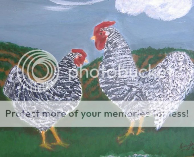
After photographing it (it’s too large for me to scan with my scanner), I used PhotoImpressions to adjust the lighting and Mom helped choose a digital frame to insert it in. I added text as well…and there it is, completed.
![]()
I’ve got to stop looking at it so that I don’t dream of fixing all those goof-ups.
Farewell and MAY GOD BLESS,
~Amanda~
Comments
Friday, April 20, 2007 – WOW!
Posted by Jocelyndixon
That is really something… you are truly an amazing young lady and everytime I read or visit your blog I am in awe!
We would be good friends if we lived close. You and I are almost the same poeple or thing in every character quiz you have on there.
I was Jo in LW but I think that’s the only one!
Great job!
Love,
Jocelyn
• Permanent Link
Friday, April 20, 2007 – Hello!
Posted by ponypassion
Hi you did a good on the Picture of the Dominique Chickens and the logo
!GOD BLESS !
~!*Mary*!~
• Permanent Link
Saturday, April 21, 2007 – Untitled Comment
Posted by DarthYxpu
Hmmm, you’re right, you should expand someday.
LOL (sorry)!
But getting something like PhotoShop Is SO expensive!
I use Linux (It’s an Operating System, like Windows).
Linux is free and so are all the programs on it. One of my favorite programs on Linux is an image editing program called The GIMP!
The GIMP is like a clone of PhotoShop, without the fancy price tag. 😛
Here’s a Windows version of The Gimp for download:
http://gimp-win.sourceforge.net/stable.html
It should be simple to install.
• Permanent Link
Saturday, April 21, 2007 – Untitled Comment
Posted by DarthYxpu
WOW!
You are amazing at drawing/painting!
I can’t believe that you did that.
So I guess that is the logo that will go in the ad. Right?
Good job!
• Permanent Link
Monday, April 23, 2007 – Amanda~
Posted by Jocelyndixon
So… am I a best friend? 😉
ok… anyway, Thanks for your kind comment. After reading yours and Eric’s blog I have been thinking if i really am posting what I should. I don’t write as well as you both do. I think you both have a better way of an intelligently (sp?) writing something out. I write fiction! LOL
And thanks – about webdesign! 😉
Love,
Jocelyn
• Permanent Link
Monday, April 23, 2007 – Hello Amanda!
Posted by queenbee
Hi Amanda you did the best job on the dominique logo I love it and I know mom,Joe,Mary and every one els does too!
~!*•GOD•*!~ Bless you Amanda!
• Permanent Link
Tuesday, April 24, 2007 – Untitled Comment
Posted by ElizabethSwann
Check out my latest post!
~ElizabethSwann
• Permanent Link
Wednesday, April 25, 2007 – Untitled Comment
Posted by DarthYxpu
Oh, np for the info.
Did The GIMP install ok? It wont work unless you install the GTK package.
Paul